If your conversions aren’t meeting your expectations, you might be curious about visitor behavior on your landing page. Are they clicking on your call-to-action (CTA)? Do they find your benefits section engaging? Are they scrolling down to read that rave review? Knowing these details can help you make informed decisions for improvement.
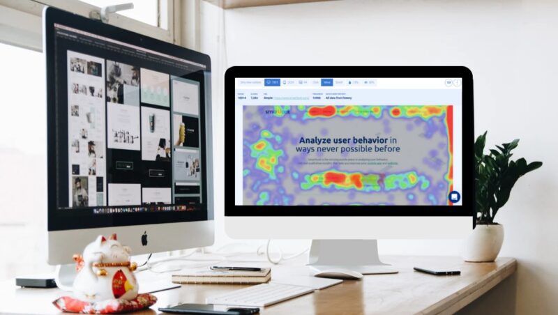
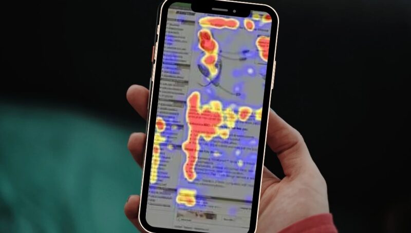
Heatmaps can provide these insights. They are effective tools for visualizing user behavior on your landing page.
In this discussion, we’ll break down what heatmaps are and how they can improve your landing pages and boost conversions. We’ll also look at some practical examples to demonstrate their real-world benefits.
By the end, you’ll see why heatmaps should be a key part of your landing page optimization strategy.
Main Types of Data
There are two primary types of data: quantitative and qualitative.
Quantitative Data
Quantitative data is numerical and is often gathered using tools like Google Analytics. This data includes metrics such as page views, bounce rate, and other web analytics. For example, if a landing page attracts 2,000 new visitors, that’s quantitative data.
Qualitative Data
Qualitative data is descriptive, based on observations and experiences. For instance, if a user submits an exit survey stating they couldn’t find pricing information, that’s qualitative data.
What Type of Data Do Heatmaps Provide?
Heatmaps are graphical representations of data that illustrate user experiences, categorizing them as qualitative data.
Applications
Optimizing Visitor Behavior
Heatmaps are invaluable for testing and optimizing visitor behavior.
Enhancing Conversion Rate Optimization (CRO)
CRO designers, strategists, and marketers use heatmaps to determine if users interact with key content or other elements on a page.
This visual summary provides crucial insights for landing page optimization and A/B testing.
The Origin
The first heatmaps were created on paper.
Early Heatmaps
Initially, small dark gray or black squares indicated high values, while lighter squares represented lower values. An example of an early heatmap is Loua’s 1873 demographic study of Paris’s 20 districts, using a color scale — white, yellow, blue, red — with white for low values and red for high values.
Modern Development
The first modern-day heatmap was developed by Leland Wilkinson, featuring high-resolution colored graphics. In 1991, software designer Cormac Kinney trademarked the term “heatmap.”
Why Use Heatmaps?
Using website heatmaps offers several benefits:
Finding the Right Website Layout
Designing a landing page can be challenging, and it’s often uncertain if the chosen design is optimal. Heatmaps eliminate this uncertainty by showing where visitors click, hover, and scroll. This data helps you adjust your website to ensure your most important content gets the attention it deserves.
Picking a Single Goal
If you’re using multiple CTAs to provide additional information, heatmaps can help you determine which CTA users engage with the most. This insight allows you to prioritize your goals effectively. For maximizing conversions, it’s often best to focus on a single, clear CTA.
Removing Distracting Elements
Usability issues can sometimes be unclear. Heatmaps can reveal if users are clicking on elements they shouldn’t be. With this information, you can rework your layout to remove unnecessary or confusing elements, guiding visitors towards desired actions.
Types of Website Heatmaps
There are three common types of heatmaps:
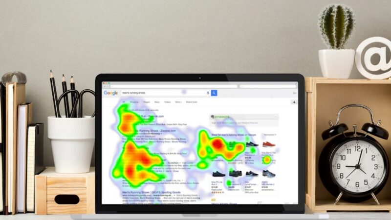
Click Maps
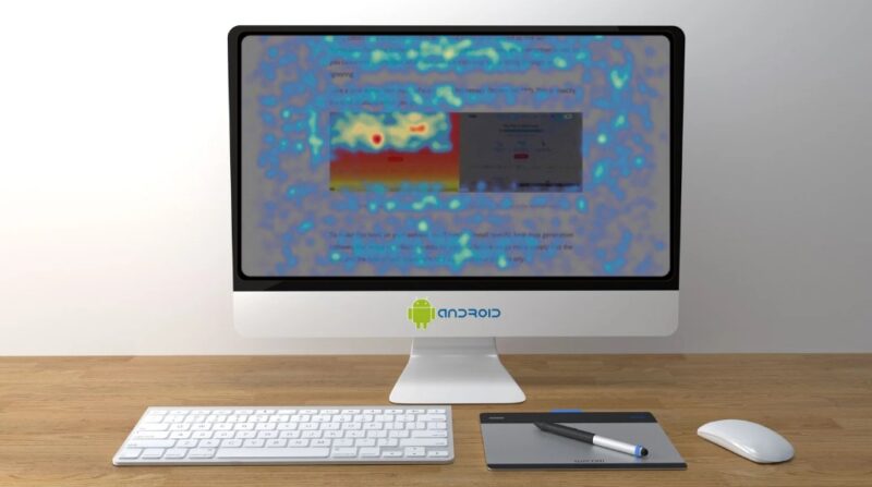
Click maps indicate areas of high interest by showing where visitors click (or touch on mobile devices). Areas with more clicks are displayed with warmer colors, while areas with fewer clicks are shown in cooler colors. This helps you understand which parts of your page attract the most attention.
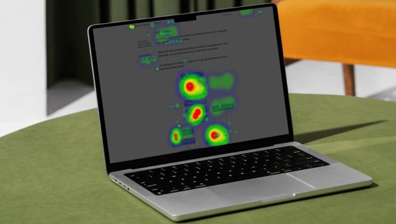
Hover Maps
Also known as move maps or confetti maps, hover maps track mouse movements to show where visitors hover their cursors. This can help identify important sections and movement patterns, although it’s worth noting that cursor position isn’t always aligned with eye gaze.
Scroll Maps
Scroll maps provide a visual representation of how far users scroll down a webpage. This is crucial for understanding engagement, as users tend to drop off further down the page. Ensuring that the most important information is near the top can improve user interaction.
Use Cases
Let’s explore some practical applications of heatmaps, particularly for an eCommerce landing page.
Click Map Use Case
Imagine you have a well-designed landing page, but you’re unsure if users understand what actions to take.
- Problem: Users are clicking on non-clickable elements, such as image captions, or not clicking on important elements like the CTA button (e.g., “Add to Cart”).
- Solution: Use a click map to identify these issues. If users are not interacting with clickable elements as intended, this indicates a need for redesign to make it clearer which parts of the page are interactive.
Hover Map Use Case
Suppose you’ve listed all the benefits of your products on your landing page, but conversions remain stagnant.
- Problem: Users hover over the benefits section but do not take further action.
- Solution: Use a hover map to track cursor movements. If users are interested in the benefits section but aren’t converting, consider refining the copy or adding compelling visuals to make the offer clearer and more enticing.
Scroll Map Use Case
You have an excellent review of your products on your landing page, yet users aren’t making purchases.
- Problem: Users are not seeing the review because they drop off before reaching that section.
- Solution: Utilize a scroll map to see how far users scroll down the page. If many users leave before reaching the review, reposition this content higher on the page to ensure it gets noticed.
Conclusion
Heatmaps provide valuable insights into user behavior, enabling you to optimize your landing pages effectively. Whether through click maps, hover maps, or scroll maps, these tools can guide your design and content decisions to enhance user engagement and increase conversions.
Popular Heatmap Tools
There are several heatmapping tools available, each with unique features and pricing. Here are some of the most popular ones:
- Mouseflow
- Crazy Egg
- Clicktale
- Hotjar
- Lucky Orange
- Inspectlet
- FullStory
- Smartlook
- Ptengine
- VWO
Each tool offers different strengths, features, and pricing options, so the best choice will depend on your specific needs.
Final Words
Using heatmaps to understand user behavior can significantly improve your landing pages.
By analyzing where users click, hover, and scroll, you can optimize your design and content to boost conversions.