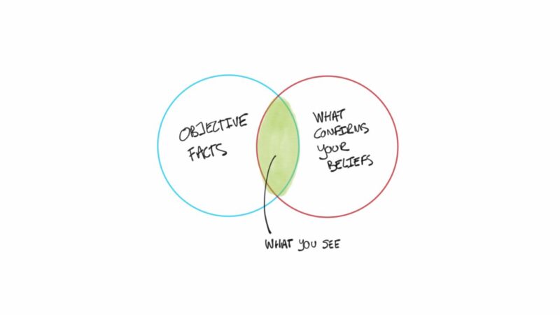
Accurate data interpretation is crucial for effective decision-making.
Misinterpreting data can lead to flawed conclusions and poor outcomes.
To address this issue properly, I want to provide you with several pitfalls so that you can avoid them efficiently.
1. Misinterpretation of Correlation and Causation
Confusing correlation with causation is a frequent error in data interpretation.
Correlation refers to a relationship between two variables, while causation indicates that one variable directly affects another.
Misinterpreting these concepts can lead to false conclusions and misguided actions.
Example:
Increased ice cream sales and higher crime rates both correlate with warmer temperatures, but it would be incorrect to conclude that ice cream sales cause crime rates to rise.
Solution:
- Statistical Tests: Use statistical methods, such as regression analysis, to determine causation. These tests help identify whether changes in one variable cause changes in another.
- External Variables: Consider other influencing factors. In the ice cream example, temperature is an external variable affecting both sales and crime rates.
Steps to Avoid Misinterpretation:
- Identify potential external variables.
- Use appropriate statistical tests to analyze relationships.
- Interpret results in the context of external factors.
2. Biased or Insufficient Data Samples
Using biased or too-small data samples can lead to skewed results and incorrect conclusions.
A representative sample is essential for accurate data analysis and generalization.
Example:
Surveying only a specific demographic group and generalizing the results to the entire population leads to biased conclusions.
Solution:
- Diverse Samples: Ensure that your data sample includes a wide range of demographics, behaviors, and other relevant factors to represent the target population accurately.
- Sufficient Size: Use a sufficiently large sample size to achieve statistical significance and reliability.
Steps to Ensure Representative Samples:
- Define the target population.
- Use random sampling techniques.
- Verify the diversity and size of the sample.
3. Lack of Clear Goals and Objectives
Without clear goals, data analysis can become aimless and unproductive. Setting specific, measurable objectives guides the analysis process and ensures meaningful results.
Example:
Analyzing sales data without a clear objective can lead to wasted resources and unclear insights.
Solution:
- Define Objectives: Clearly outline what you aim to achieve with your data analysis. Objectives should be specific, measurable, achievable, relevant, and time-bound (SMART).
Steps to Define Clear Goals:
- Identify key business questions or problems.
- Set SMART objectives.
- Align data analysis with business goals.
Bullet Points: Benefits of Clear Objectives
- Focused data analysis.
- Efficient resource allocation.
- Clear insights and actionable recommendations.
4. Poor Quality Data
Inaccurate, incomplete, or outdated data can lead to unreliable analysis and flawed conclusions. Ensuring high-quality data is fundamental to accurate data interpretation.
Example:
Using customer data with numerous duplicates and errors can distort analysis outcomes.
Solution:
- Data Cleaning: Implement data cleaning processes to remove duplicates, correct errors, and fill in missing information. Automated tools can help streamline this process.
- Data Validation: Regularly validate data to ensure accuracy and relevance.
Steps to Improve Data Quality:
- Perform regular data audits.
- Use data cleaning tools and software.
- Establish data governance policies.
Bullet Points: Data Quality Best Practices
- Regularly update and verify data.
- Use standardized data entry formats.
- Implement data governance frameworks.
5. Ignoring Data Outliers
Outliers can indicate significant trends or errors but are often ignored. Properly analyzing outliers helps uncover valuable insights and potential issues.
Example:
Overlooking a sudden spike in customer complaints can miss identifying a critical problem.
Solution:
- Analyze Separately: Examine outliers separately to understand their causes and impacts. Determine whether they represent significant trends or anomalies.
- Investigate Causes: Investigate the root causes of outliers to take appropriate action.
Steps to Handle Outliers:
- Identify outliers using statistical methods.
- Analyze outliers in context.
- Investigate and address the root causes.
Bullet Points: Importance of Outliers
- Reveal hidden trends.
- Identify potential errors.
- Highlight areas needing attention.
6. Inconsistent Data Formats and Sources
Combining data from different sources without standardization can cause inconsistencies and complicate analysis. Standardizing data formats ensures reliable and accurate interpretation.
Example:
Merging sales data from various regions with different date formats can lead to errors and misinterpretation.
Solution:
- Standardize Formats: Before analysis, standardize data formats such as dates, currencies, and units. Use centralized data systems to maintain consistency.
- Data Integration Tools: Utilize data integration tools to combine data from different sources seamlessly.
Steps to Standardize Data:
- Identify data sources and formats.
- Standardize formats before merging data.
- Use data integration tools and systems.
7. Incorrect Data Visualization
Choosing the wrong type of visualization can mislead stakeholders and obscure the true meaning of data. Appropriate visualizations enhance understanding and communication.
Example:
Using pie charts for time series data can mislead stakeholders and obscure trends.
Solution:
- Select Appropriate Visualizations: Choose visualizations that best represent the data type and the message you want to convey. For time series data, line graphs are more suitable than pie charts.
- Visualization Tools: Use data visualization tools to create clear and accurate representations.
Steps to Choose Correct Visualizations:
- Understand the data type and context.
- Select visualizations that match the data characteristics.
- Use tools like Tableau, Power BI, or Excel for creating visualizations.
Bullet Points: Common Visualization Types
- Line Graphs: For time series data.
- Bar Charts: For comparing quantities.
- Pie Charts: For showing proportions.
- Heatmaps: For displaying data density or intensity.
Related Posts:
- How Data Interpretation Tools Helped Us Increase…
- How Can Data Analysis Improve Your Marketing Strategy?
- Is Machine Learning the Future of Data Analysis?
- Everything You Need To Know About Data Sampling in GA4
- Fun, fun, and more fun! come work at Beyond
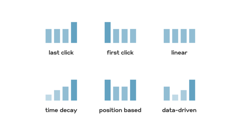
- Why Should You Understand and Implement Attribution Modeling